Deep Dive: Animating Text
“Great game text” is one of those features you only think about when it’s gone missing…which means it should never be overlooked! The solution is often more complicated than just updating the font or line height. Even though Very Very Valet isn’t a text-heavy game, we’ve long been passionate and appreciative of games with really killer script presentation. The approach and technology is also infinitely reusable - nearly every conceivable game/app/project will have some use for great text!What makes text “good”
Of all the platforms out there, few have a better text record than the Nintendo 3DS. Really! The pairing of small screen size AND limited resolution led developers to utilize a set of techniques for making text a pure pleasure to read. Text-heavy games like Ace Attorney should be a nightmare to play - yet are treasures to be coveted.Here’s a couple running ideas from the 3DS era:The AMOUNT of text. If you want character and characters (heh) on screen, concessions are necessary! Games tend to limit text to just 2-3 lines. This forces your language to be direct and brief. A screen’s worth of text has room for one idea - information OR a punchline, not both.The METHOD of text. It takes time to speak, so it should take time to display. A character’s speech cadence can be replicated through speed, pauses, and gaps. It doesn’t need to take that long either - keeping it snappy prevents the game from grinding to a halt.The STYLE of text. Make every word count, whether via color or effect! For players in a rush, highlight the necessary information. For everyone else, charm their socks off.
How to make it work (In Unity)
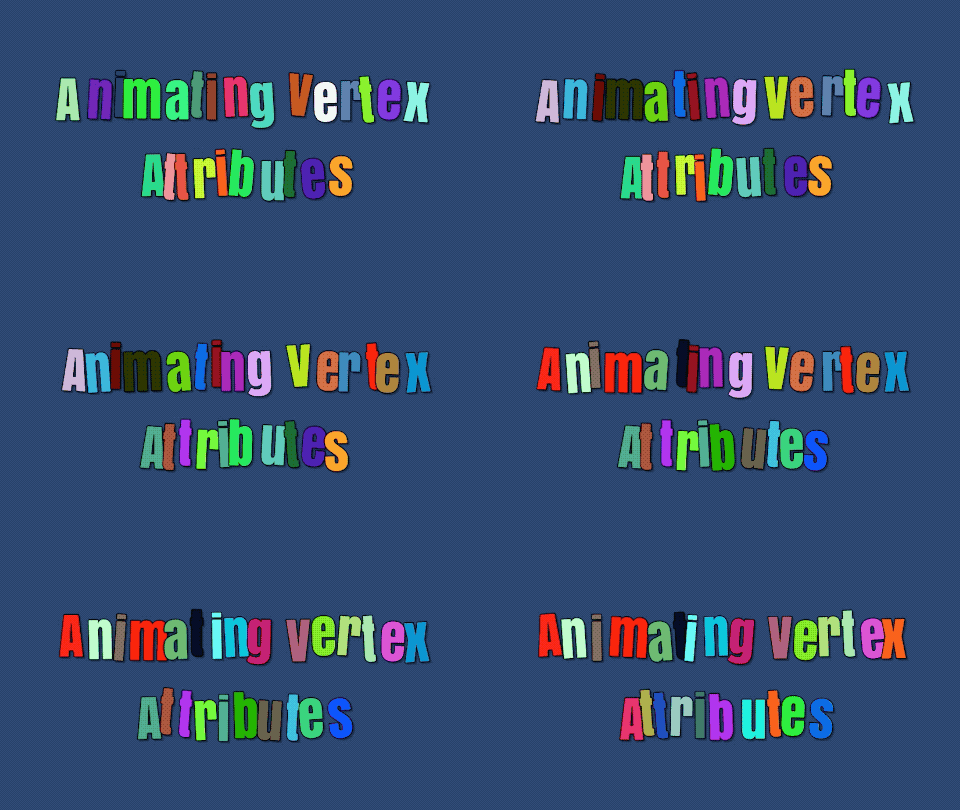
We use Text Mesh Pro as our UI/text solution - which has a bunch of great example scripts as part of the TMP package (TextMesh Pro / Examples & Extras / Scripts). VertexJitter.cs, which makes letters wiggle, was the perfect entry point to build out our custom animations. Ideally as an official TMP example, this code flow remains supported for a while (sweats nervously)From this example, we built out our animation scripts - split between a single “owner” script and individual “effect” scripts. The owner handles all of the meta string manipulation: identifying which characters to adjust, manipulating matrices, etc. This allows the effect scripts to be singularly focused on animating: one for wiggling, one for waving, one for scaling. Breaking up the effects also allows for them to be easily combined, since the owner is able to run multiple effects on a single string.But what if we want to animate individual words? Or have one word wiggle, and another wave? While we could have built additional rich text formatting, TextMesh Pro actually allows for information to be attached in a <link> tag. Any TMP_TextInfo has a list of links in the string, and TMP_LinkInfo.GetLinkID() will return the string included in the tag. On startup we cached the positions, and then determine which effects to apply to which letter. Once the system is in place, it’s simple to embed information into a string as well - adding pauses as the string types out, or even what emotion the speaker should display.The final result
With that said, the devil is in the details! We had a whole bunch of assumptions about how this should animate - a slowly accelerating curve, scaling and fading in the characters, making it snappy but not too snappy. This was not producing the desired results (To say nothing of how hard it is to read on that background!)So we embarked on one of our favorite and most useful game dev tools: “covering”. The essential idea is to learn from the best, like how a musician might start by “covering” their favorite songs to build up their knowledge before trying something new of their own. We love how text works in all of the 3DS games…maybe it’s time to actually study and see HOW they do it. Time for some sweet sweet frame by frame analysis, and an accompanying spreadsheet! We looked as several different lines in Rusty’s Real Deal Baseball to see just how the text gets onscreen (Editor's note: this is clearly a Chad post). Likewise, seeing if there’s any difference when the string is long versus short.As usual, the implementation tends to be simple but effective:No actual character manipulation - they just pop inNo difference in animation based on string lengthLinear reveal speed! Though very fast at 3-4 characters a secondConsistent highlighting - a color for nouns vs verbs
With these lessons in mind, we took another pass at our text. Surprise!…it looks way better. Forcing each blurb down to just 3 lines of text was incredibly helpful as part of the editing and refining process. Only the very best gets to stick around!Additional Notes
Implementing the individual animations as individual scripts is sensible - but it also means that there’s a ton of information just kind of floating in the scene. If you want to update the way the wiggle works, that means changing it in so. many. places. Because of this we got into the habit of putting all of the animated effects onto an empty prefab, and then linking it to the animated text. This kept all of the information in a unified place making adjustments a snap!Again, this tool is never not nice to have around! The “Ready Set Valet!” screen uses it to animate in the last string. This would have been much harder to replicate with traditional animation, to say nothing of how hard that would be to localize. The ability to animate characters simplifies it greatly!


