Deep Dive: Shaders & Effects
Very Very Valet is a visually “simple” game, but achieving the look of the game still came with some interesting challenges. Let’s take a tour of some of the more notable shaders and visual techniques in the game.SHADOWS
First up: shadows! Wait, don’t you get shadows for free in Unity? Yes, but not how we needed. We wanted pretty baked lighting coming from a sun at an angle, while still having perfect straight-down gameplay shadows:So we added an orthographic camera in the scene that renders with a special shader that just outputs the depth of each pixel. Only certain objects are tagged to render into this camera, and often with simplified meshes. Brighter red = closer to the camera.A script on the camera sets some shader globals that include the matrix for computing shadow UVs from world space coordinates, as well as other values like offsets, biases to avoid self-shadow artifacts, etc.We created a shader “sub-graph” for calculating if a given pixel is in shadow or not. It also fades out the shadow at the edges of the region to avoid hard edges as objects enter/exit the shadow area.Here is an example of our car shader. You can see that after calculating the main color, we read the shadow, and potentially transition to a shadow color instead, if the area is in shadow.The end result are clean shadows that emphasize readability, while still looking nice!SILHOUETTES
Next: “silhouettes” for when Valets and/or cars are obscured from view. This is a pretty well-known technique, here is a recap animation of video of how it works.FUZZY CHARACTERS
Next: “fuzz”! To try and make our character appear more like puppets that are soft and fuzzy, we ended up using a fairly hacky screen-space approach, explained in this video.TELEPORTER TUNNELS
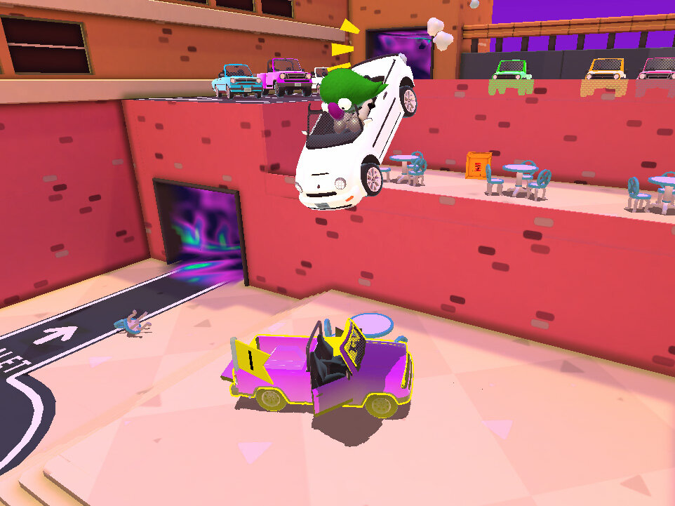
Next: “Teleporters”! This is also a pretty simple combination of a few things: scrolling layers of noise, a specifically crafted mesh, and some vertex displacement. Breakdown in the video!


