Deep Dive: Level Creation
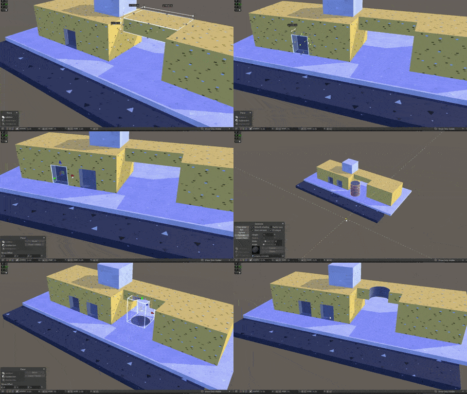
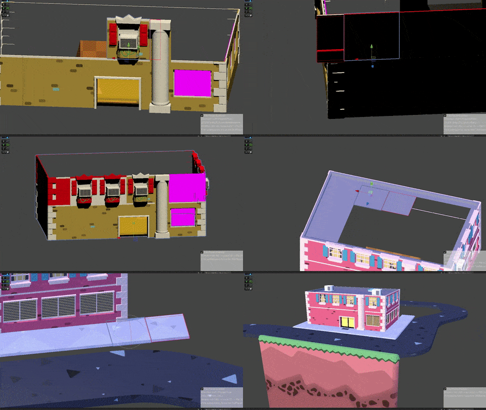
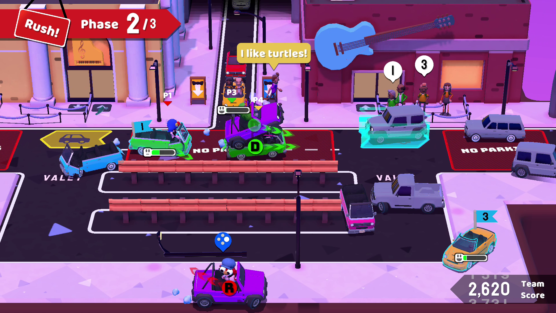
Very Very Valet is all about cooperatively parking and returning cars. One of our pillars is "Variety", which will mostly come from the different level layouts. So we needed a way to easily create and iterate levels, while keeping art costs in check.To get started we needed to iterate on level layouts quickly and easily. We found a great tool called RealtimeCSG (Realtime CSG) that worked great for us. It's CSG based, so it's easy to reposition, adjust, and edit without worrying about meshes, verts, etc. This kind of tool makes is super easy to slide a door around, cut out a section of a building, etc. all without worrying about the mesh itself, just focusing on the shapes.The entire prototype was actually made using levels blocked out w/ RealtimeCSG. We quickly confirmed that even slightly different layouts made for levels that played very differently and provided a lot of variety. The video to the left is our very first prototype, showing our first iteration of what would become the "mascot" (and first) level of the game "Rooftop Parking".Unfortunately, the thought of making high quality visual meshes for each level based on our block-outs was daunting and likely to go over our budget. So we made a big decision: we would construct our levels out of "tiles" that could snap together.The benefits of a tile-based approach:1️⃣ Consistent metrics! All streets will be the same width, all slopes are the same angle, etc.2️⃣ Make a tile pretty once, and all levels that use it look pretty :)Here is an example of a zoomed-in area of a level, showing the tiles.Potential pitfalls of using tiles:1️⃣ Pain to align and place individual tiles in the editor2️⃣ Levels will all look the sameHow we addressed these issues: First we made some tools to make it easy to find and preview tiles, and also place them down with keyboard shortcuts:To avoid levels looking same-y, we:➡Focused effort on tile variants, especially for buildings.➡Made tools to make it quick and easy to adjust all tiles on an entire building at once: change materials and colors, window frames, sills, roof props, etc.The end result is a nice variety of levels that we were able to create, iterate, and tune throughout development, while still reaching our art quality bar. It wasn't all efficiency and beauty though...We initially spent a lot of time making UV maps for each (building) tile, in order to use "trim sheets" to replace materials on tiles (switch brick -> stone, etc). originally we had imagined a more realistic art style for the game, so this felt necessary.Mid-development, we decided to simplify the art style to be more graphic: focus on the color palette and simple graphic patterns for surfaces. We also switched to tri-planar mapping for most materials, which removed the need for complex UVs, and reduced repetition across tiles.Here’s a quick look at the tri-planar shader with layers for a main texture, pattern overlay, and various options for alignment, scale, etc. A lot of the look of the game is coming from combining simple models with nice colors and patterns, and some clean lighting.Special bonus video! Line Renderers in Unity kinda stink, so we made our own tailor-made for making street lines, with support for dashed lines (as geometry), specific corner radius control, specific control over alignment and normals, etc.


